Candlestick Patterns Explained
Something that every trader, whether in stocks, Forex, or otherwise, needs to be familiar with are candlestick patterns. Candlestick patterns in Forex are big time aspect of technical analysis, and if you know how to read them properly, they can help you win trades and make money. Right now, we want to go over some of the most common candlestick patterns, what they mean, and how to read them.

Candlestick Patterns Explained – What Are They?
The first important thing to know here is that candlestick patterns indicators are a way of displaying information about the movement of the price of an asset. It’s all about predicting the future movement of a price.
In fact, when it comes to technical analysis in Forex, the candlestick pattern chart is one of the most popular components of it. The reason why these charts are so popular in technical analysis is because they allow traders to get a lot of information about the price of something quickly and reliably.
The Benefits of the Candlestick Patterns Chart
You might be wondering what exactly about candlesticks patterns charts is so beneficial and why technical traders use them so much. Let’s take a look at the main benefits of these candlesticks right now.
Determining Market State
One big benefit of these patterns is that they allow traders to determine the state of a market with nothing more than a quick glance. Traders can instantly tell if a market is bearish or bullish.
Determining Market Direction
Another benefit of these patterns is that the color and the shape of the candlesticks helps traders to determine if an upward movement in price is part of a bullish run, or if it is just a bearish spike.
Identifying Market Patterns
The third main benefit that comes with using candlestick patterns is that they help traders by displaying specific info bout bullish reversal patterns and bearish reversal patterns. These are things that cannot be seen so easily on other types of charts.
Candlestick Patterns Cheat Sheet – How to Read Them
When you look at candlestick patterns, whether for trading stocks or Forex, you will need to know how to read them. A big part of reading candlestick patterns is knowing what the main components are. These patterns come with 3 main components that you absolutely need to be familiar with.
- The Body – This represents the open to close range
- The Wick – Also known as the shadow, which indicates the intraday high and low
- The Color – The color of the candlestick will reveal the direction of the movement of the market. A green or white body indicates an increase in price, whereas a red or black body indicates a decrease in price.
If you learn how to read these properly, you can then identify key areas of support and resistance, thus providing you with market entry points to execute trades upon.

Bearish Candlestick Patterns Explained with Examples
Of course, when a market is bearish, it means that there is a downtrend or downturn in price in a specific market. Bearish candlestick patterns generally form after a market uptrend.
They signal that there is a point of resistance coming soon, and that the market may very well turn downwards. This is where traders often open a short position in order to take advantage of falling prices. Let’s take a look at some examples.
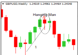
Hanging Man
The hanging man pattern takes the form of a short body with a long lower wick. Both the hanging man and the hammer pattern have the same shape, but a hanging man usually forms at the end of an uptrend. The hanging man candlestick pattern indicates that there was a lot of sell-off during the day, but buyers were able to push the price upwards by the end of the day. This sell-off is usually taken as an indication that bulls are losing market control.
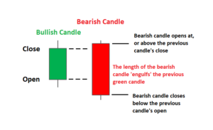
Bearish Engulfing
The bearish engulfing candlestick pattern will generally occur at the end of an uptrend. This pattern actually consists of two candles, with the first one being a green candle with a small body and a small downward wick, which is totally engulfed by a large red candle. The bearish engulfing pattern generally signals that there is either a peak in price or a slowdown in an uptrend, thus signaling an impending downturn. The lower this candle goes, the stronger the coming trend is going to be.
Bullish Candlestick Patterns Explained with Examples
On the other hand, when the market is bullish, it means that there is an upturn in price in a specific market.
Bullish candlestick patterns generally form after a market downtrend and they signal that there is a point of support coming soon, thus indicating that an upturn is in the works. This is where traders open long positions to take advantage of rising prices. Let’s take a look at some examples.
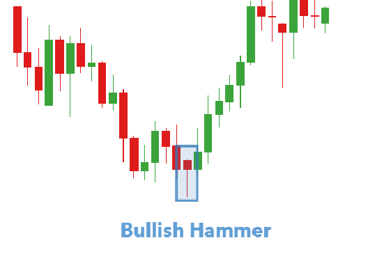
Hammer
The hammer candlestick hammer pattern takes the form of a short body with a long lower wick. This is found at the bottom of a downward trend. A hammer pattern generally indicates that there was some selling pressure throughout the day, but that a strong buying pressure ended up driving the price upwards. The color of this candlestick can be red or green, although green hammers indicate a stronger bull market.
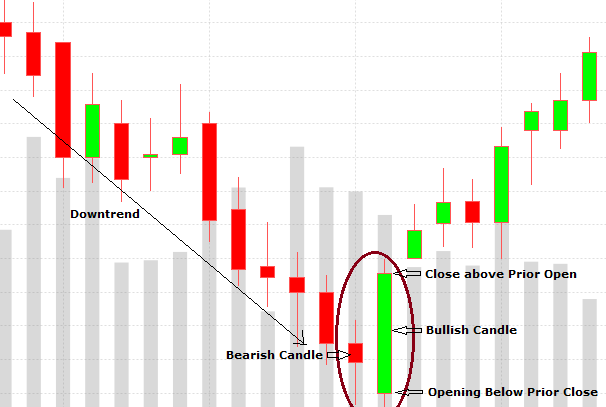
Bullish Engulfing
What is important to note here is that the bullish engulfing pattern is actually formed by two candlesticks. First you will see a short candlestick with a red body and a small upper wick, which is totally engulfed by a green candle with a shorter body and a long upward wick. This indicates that although the price on the second day opened lower than on the first, the bullish market is pushing the price up, thus making it a good opportunity for buyers.
Candlestick Patterns Explained – Final Thoughts
If you can understand and master candlestick patterns, then you are well on your way to becoming a profitable trader. Stay tuned because we have a lot more information about candlesticks coming your way soon!